
CI
The CI of Samyang Group
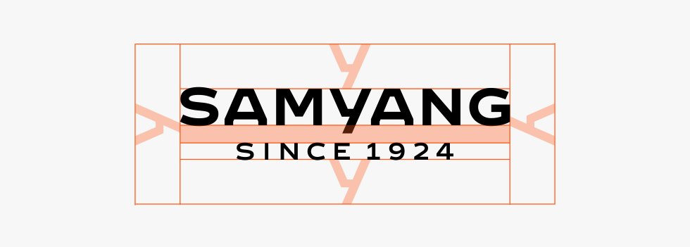
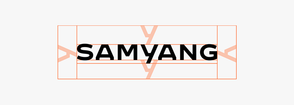
Samyang Group’s CI is composed of two forms to express its confidence based on 100 years of history, trust, and expertise: One with ‘SINCE 1924’ combined and one with the CI alone. The combined version of the logo emphasizes the establishment year of the Samyang Group, conveying trust and its history, and is primarily used for connecting and communicating with customers.
Introduction
to the CI
The CI of the Samyang Group is a meticulously designed logo centered around our name, Samyang, representing the confidence built on 100 years of history, trust, and expertise. It was developed in collaboration with Brody Associates, led by world-renowned designer Neville Brody, specializing in branding and typographical design.
Subsidiaries
To ensure a consistent brand identity across all Samyang Group subsidiaries, we provide CI application guidelines. These guidelines ensure the consistent application of lock-ups, reflecting Samyang's current relationships with its subsidiaries and future-proofing the corporate identity.
CI Guidelines
Corporate Colors
- Legacy Blue
- White - Legacy Blue
- Black
- White
Size Regulations
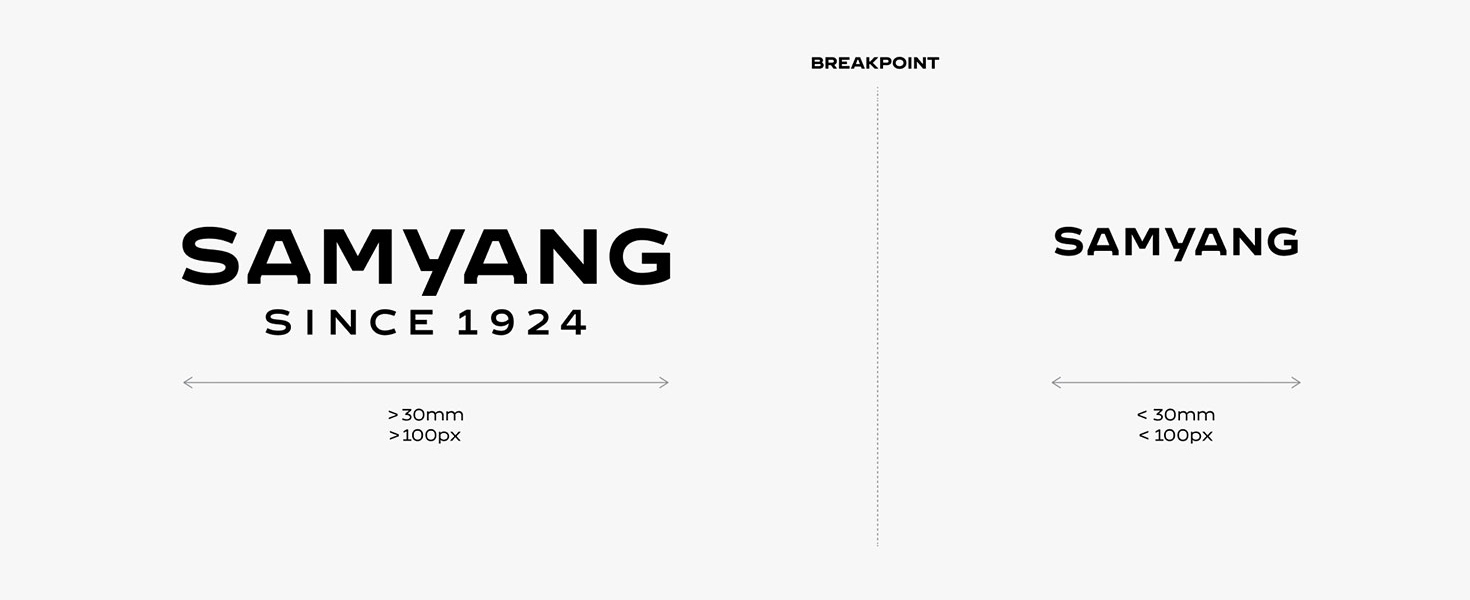
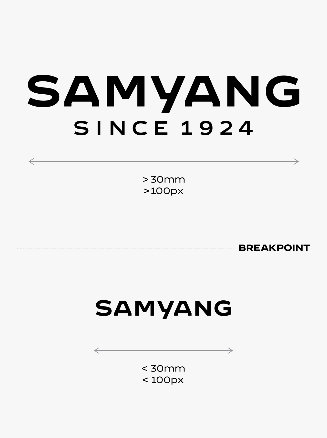
If the width is 3 cm or below, use the basic CI alone instead of the combined version for readability.
Clearance Space
The spacing guidelines ensure that the CI logo maintains optimal readability and visibility. When applied across various media, the centerline and spacing rules must be followed to prevent interference from other elements or complex patterns.
Dynamic Impact
Dynamic Impact is a symbolic visual language extended from the "Y," a defining feature of the Samyang CI logo. Samyang Group’s technology, products, and the customer experiences that arise from the group’s contributions to the world are conveyed through a segmented spatial layout.
